WCAG2 Are You Still Using It? UI Contrast Visibility Standard (Readability Contrast)

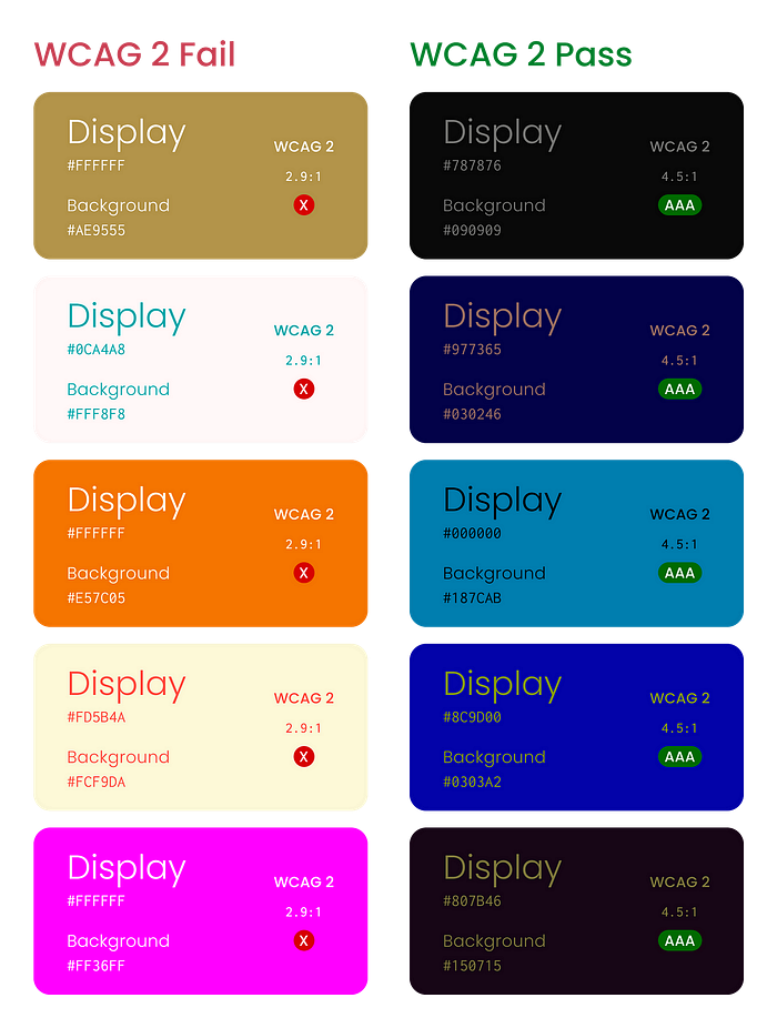
The orange background with the white text Button always fails on WCAG2, can’t it be used? Or is it based on the designer’s “feeling”?
I think ordinary people cannot represent the eyes of color-blind individuals. If choosing based on experience just because WCAG does not pass, maybe further exploration can be done…
Introduction
Have you ever thought about it? The widely used WCAG standard in the UI design field sometimes shows a ‘Fail’ result in certain situations, but to our eyes, it doesn’t seem to be a big problem.
This is because of the inherent calculation method of WCAG, which will be explained below, as well as how the new standard APCA can address existing issues and continue to shine in the future UI field.
It is recommended to read before
- Understand the basics of WCAG before reading.
- Have a basic understanding of color theory.
- This article does not delve into APCA applications.
What is WCAG?
WCAG (Web Content Accessibility Guidelines) itself is not only a Color Contrast function, it is a comprehensive web accessibility guide, so here we do not negate the usefulness of WCAG in Color Contrast, nor do we negate its contributions in other areas.
The WCAG 2.x version uses a binary distribution, that is Pass & Fail to inform users whether the colors meet the visibility contrast, but the perception of contrast by the human eye is non-linear, so it does not take into account the high dynamic range contrast of the human eye, which is unfair.
High Dynamic Range
I want to use photography to give an example:
I believe everyone has the experience of shooting against the sun when taking photos in the bright sun, but what the camera sees as pitch black, our eyes do not see, that is, the sharpness of the visual sensory nerves of the eyes themselves. Due to the automatic adjustment of the pupil, it can control the amount of light entering, so in a backlit environment, the eyes can still see objects clearly.
Conversely, if the camera has a larger photosensitive component, the effect in a backlit environment will be much better (such as Hasselblad’s medium format film sensing element). In situations where the frame size is limited, camera (phone) manufacturers will use HDR high dynamic range photos for multi-frame synthesis to achieve the closest effect to the human eye. Thanks to the development of Micro LED, and OLED in the future, the media we interact with digital content will gradually move towards HDR content. This is another story.
WCAG2’s issue: formula
The problem has slowly emerged, WCAG calculates using the relative brightness value of colors (luminance), that is, the brightness of a color itself.

*R, G, and B are the red, green, and blue components of the color, respectively
Color Relative Luminance Calculator This website can calculate luminance. Then, process the text with the background color ratio:

*L1 is the luminance of the foreground color
*L2 is the luminance of the background color
Simply put, WCAG uses the relative brightness of colors as a basis for calculation, which does not conform to the adaptive nature of the human eye.
Relative brightness is fixed, but the adaptability of the human eye is dynamic, how can it be correct?
Let me give you an example I really like:
Suppose a completely dark room with 100 lit candles, will it become brighter? Yes.
After adding another 100 candles on top of the initial 100, will it be even brighter? Yes.
However, which transition, from 0 to 100, feels brighter, or from 100 to 200?
From a perceptual perspective, the transition from 0 to 100 should feel more noticeable. But oddly, even though the brightness difference is the same at 100 candles, why does it feel different? The answer lies in the adaptability of the human eye.
Where WCAG 2.X went wrong
According to the above formula, when our text and background colors are both light-colored, this will cause the calculated value to be low due to the high relative luminance value of the color itself.
Conversely, in the case of colors with low relative luminance values, applying the formula will result in a high calculated value.

WCAG original author’s words
As of the 19th of June, 2019 edit: I will reiterate a bit because “accurately modeling lighting displays (luminous screens) under real-world environmental conditions” is not possible. WCAG fails miserably with mid-range colors because it cannot adapt to human non-linear perception. Therefore, it is not suitable for systematic viewing of digital product readability, especially in the mid and dark ranges.

APCA
Advantages of APCA
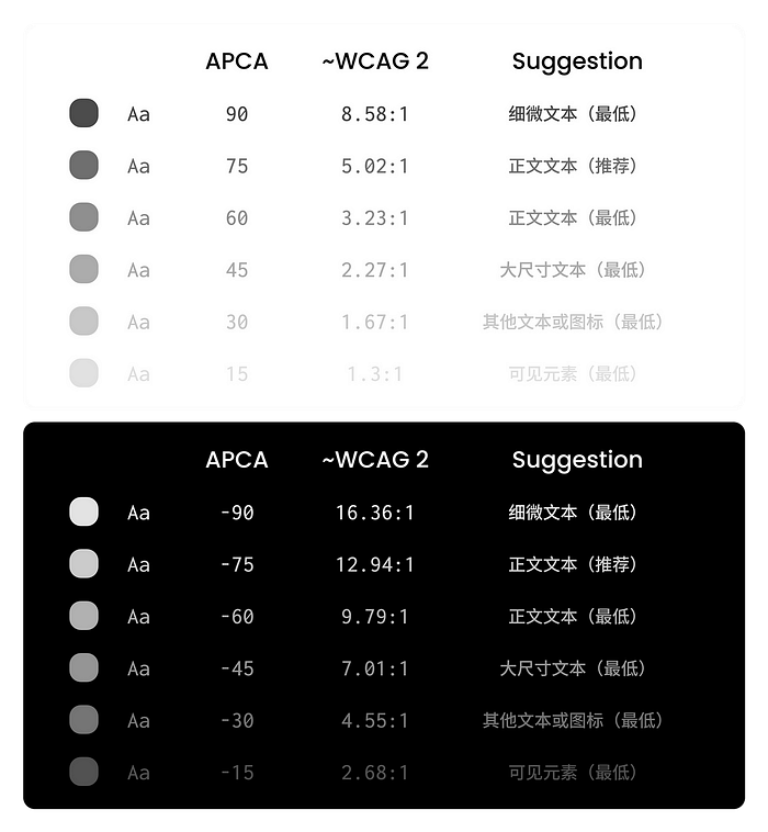
APCA (Accessible Perceptual Contrast Algorithm) is a new model that calculates the result based on the lightness contrast Lc. We will not elaborate on the standard Lc values for each icon and text, as there are plenty on the internet. The most intuitive benefit is that APCA can reference positive and negative values at the same numerical value in light and dark backgrounds, designing a color system with more consistent contrast.

Difference from WCAG2.X: Formula
The flaws of WCAG2.X come from formula problems, and APCA naturally improved this fundamentally, with its formula as follows:

*Lc(foreground) is the lightness of the foreground color
*Lc(background) is the lightness of the background color
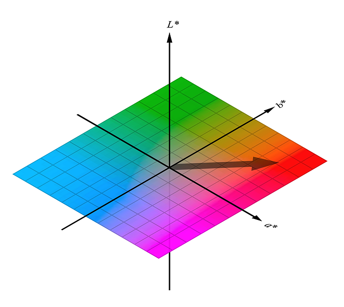
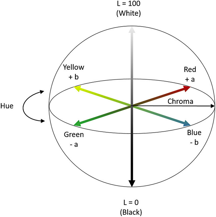
Lc is derived based on the CIE Lab Color Space, which is a perceptually uniform color space, taking into account the human visual system’s response to different wavelengths of light.

ACTTR Technology — CIELAB Color Space and Coordinate Exchange This link can calculate the color’s coordinate position.
Lc can be calculated by applying the RGB values we know into the formula to obtain f(L) and then calculate Lc. f(L) is the function that maps RGB values to the CIE Lab space, the formula is as follows:

*L represents the brightness of color (luminance), ranging from 0 to 1. Next, calculate Lc using f(L) as follows:

The Lc of colors is a number between 0 and 100. A higher Lc value means the color is lighter (brighter), common Lc values for colors can be referenced:

Common Lc values reference
Sharp-eyed readers may have noticed that the root of the APCA formula, f(L), is based on the calculation of the CIE Lab color space, which is itself a model based on the wavelength response of the human eye to light. Therefore, the results of the entire APCA color standard can be used as a more human-eye-friendly way for UI designers to reference color readability when designing digital content.
Conclusion
WCAG2.X standards have been in the industry for many years, but the media devices used in the era when WCAG2.X was created (CRT screens) are incomparable to today’s LCDs and LEDs. The contributions of WCAG2.X standards to the past design industry are undeniable, but when there are updated standards that are more in line with current needs, perhaps it is time to upgrade.
So far, it seems that there are not many designers or teams in Taiwan discussing and using the APCA standard. Perhaps some specific service targets require the design to comply with the WCAG2 standard to ensure universality. Since the APCA standard is still under development and not widely used, Figma has many plugins supporting contrast detection through APCA. Perhaps we can slowly start incorporating it into our workflow from now on.
